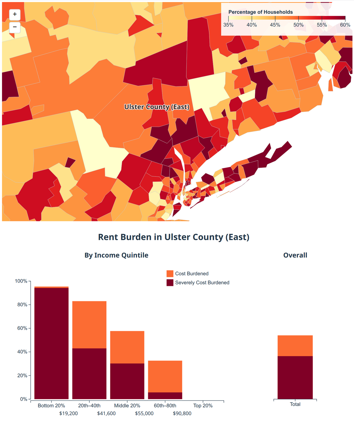
Data Explorer: Rent Burden in the US

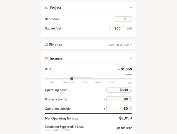
My favorite thing about the belief that developers regularly make huge profits is that it suggests an immediate and obvious solution to the housing crisis: you! That's right, you can simply build affordable housing. Build housing and rent it out at honest working-class prices by accepting meagre
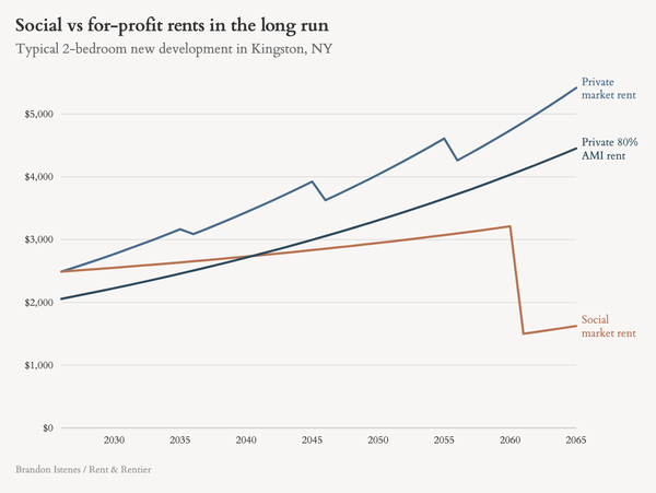
In 1937, affordable housing was invented. It wouldn't be called "affordable housing" until the 1980s, and lots of housing had been affordable before then, but that was the year that the United States Housing Act introduced income-restricted housing. Later amendments would tie these income restrictions
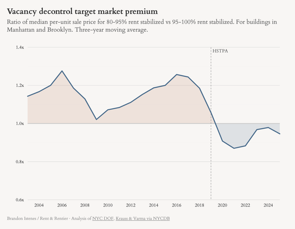
Sorry it's been forever. New year, new NYC mayor, exciting times to be getting back to writing about housing. Also I finally have my very own ✨chart aesthetic✨ so get ready, dear nerds. As New York City approaches a rent freeze, people continue to be up in arms
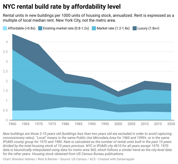
The results of this one were a big surprise to me. The question I asked is, are rents high because the new housing that's being built is too expensive? There's a lot of attention on how expensive market-rate housing is and how much luxury vs