The Collapse of Housing Affordability
Housing has gotten much more expensive in the last half century. We can learn a lot about how the rental market works by looking at who has borne that burden.

Economists are known for sharing charts that look like this, when discussing economic well-being in recent history:
This is a plot of United States GDP per capita, inflation-adjusted, since 1947. It is on a long upward trajectory. It conveys a sense of unbridled optimism about the way things have been going. Here in 2025, many of us have trouble relating to this kind of triumphalism. So this is a story about how access to one of the most fundamental human needs has become increasingly precarious.
As we're all aware (or as Instagram influencers can inform us), housing has gotten much more expensive in the last half century. Below is a chart of rent burden over time, which is comparable to the one from the Joint Center for Housing Studies, but goes back to 1960. A household is rent-burdened if it pays more than 30% of household income on rent; it is severely rent-burdened if it pays more than 50%.
Here we can see rent burden steadily increasing from 1960 until 2011, after which it stabilizes. 2011 was the year that rent burden peaked prior to 2023. In that year, more than half of all tenants in the United States were paying more than 30% of income on rent. Until 1970, less than a quarter of renters were cost-burdened.
Clearly, housing affordability has gotten worse since 1960. This isn't exactly news. But we are interested in understanding who that burden falls on. And if your guess is "the poor" (good guess), then we should ask, how poor? Are we talking about people on welfare, or people with minimum-wage jobs, or are we talking about something more widespread?
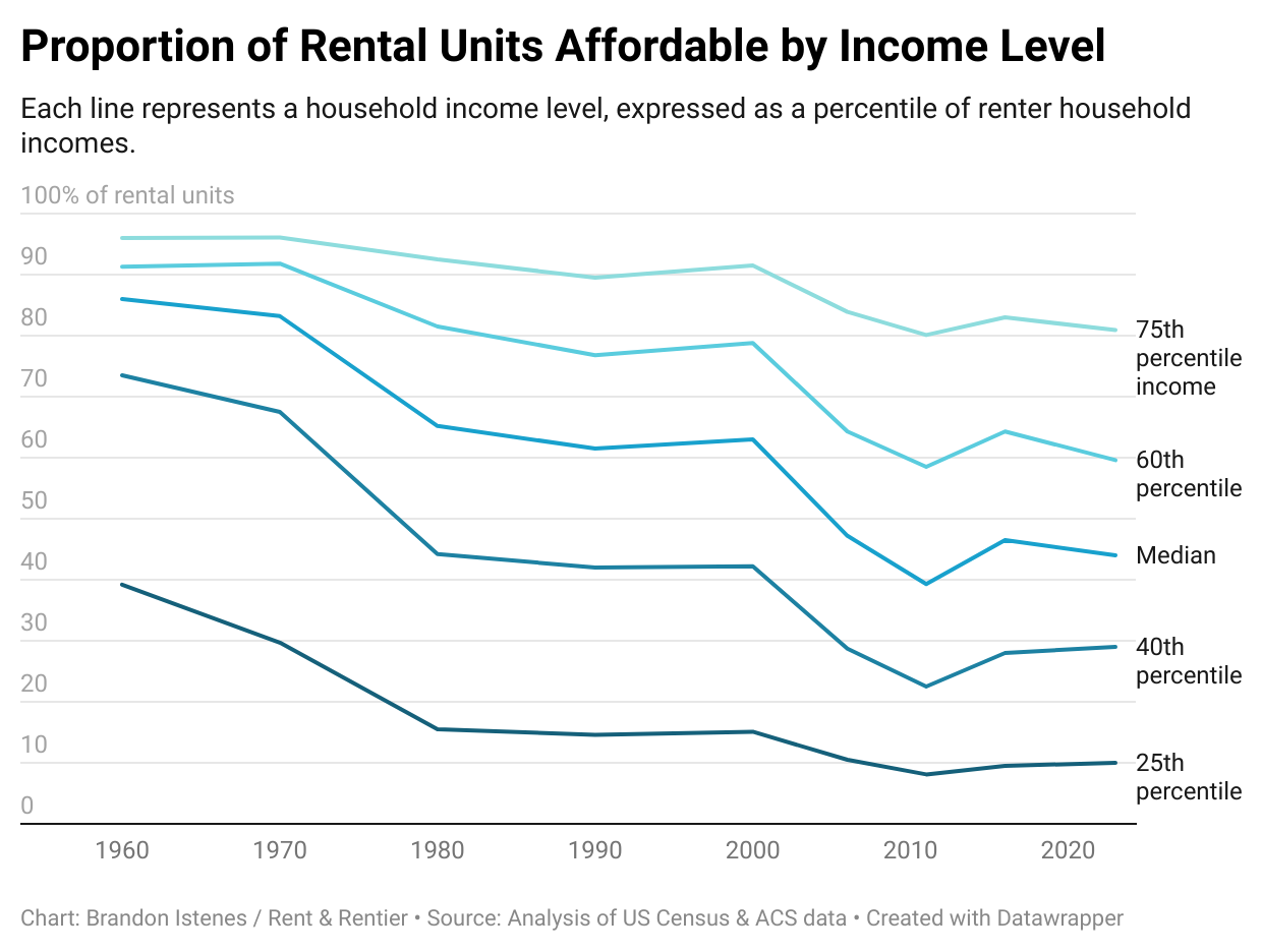
The rental affordability curve can help us assess that. In my last post, I introduced the rental affordability curve, a tool for visualizing how much affordable housing is available to renters across the income spectrum. If you haven't heard of a rental affordability curve before, go read that post. Below is the rental affordability curve for the United States, 2023. It shows the proportion of rental units which are affordable to a household based on their income, their state, and number of bedrooms. Incomes are household incomes, represented as a percentile of all renter household incomes.
Using U.S. Census data, we can plot the development of this curve over time. We have comparable data going back to 1960. Here is a set of charts showing the evolution of rental housing affordability since then.
Honestly, my jaw dropped when I first saw these numbers. It's not just that affordability has gotten worse across the spectrum. The vast majority of the rental stock used to be affordable to the median renter. The 30th percentile household income in 1960 was $2,745 per year, or about $28,500 in 2025 dollars. That's just a little under what it is today. The 30th percentile household in 1960 could afford more than half of the rental stock. That's like if the median one-bedroom rent today was $700. Today, only 13% of rental units are affordable at that level, and the median one-bedroom rents for over $1,500.
What happened in between those dates? We can look more closely by picking a few income levels and graphing those across time.
Several things stand out. First, affordability was declining from 1960 to 1970, but really fell off a cliff after 1970. That decade is where we see the largest drop in the proportion of units affordable to the poorer 50% of Americans.
Second, as with the graph of cost-burdened renters above, affordability was more or less level from 1980 to 2000.
Third, affordability during the 2000s housing bubble also declined significantly for those with higher incomes, which was not the case in previous decades. Affordability at the 25th percentile was hardly affected, but this is because it probably cannot go much below 10%. That is to say, the situation for the poorest renters in the 2000s did not get much worse because it was already about as bad as possible. There will always be some small share of houses on that very bottom end.
Finally, the pandemic pushed high rents higher, but had little impact on rents that were already low.
To simplify somewhat: from 1960 to 1980 was when housing affordability collapsed for poorer Americans, and the 2000s was when it collapsed for the middle class.
This is a very different story from the one told by home prices and incomes over that same period. Here is the same graph I shared in the last post, the Case-Shiller Index adjusted by median household income.
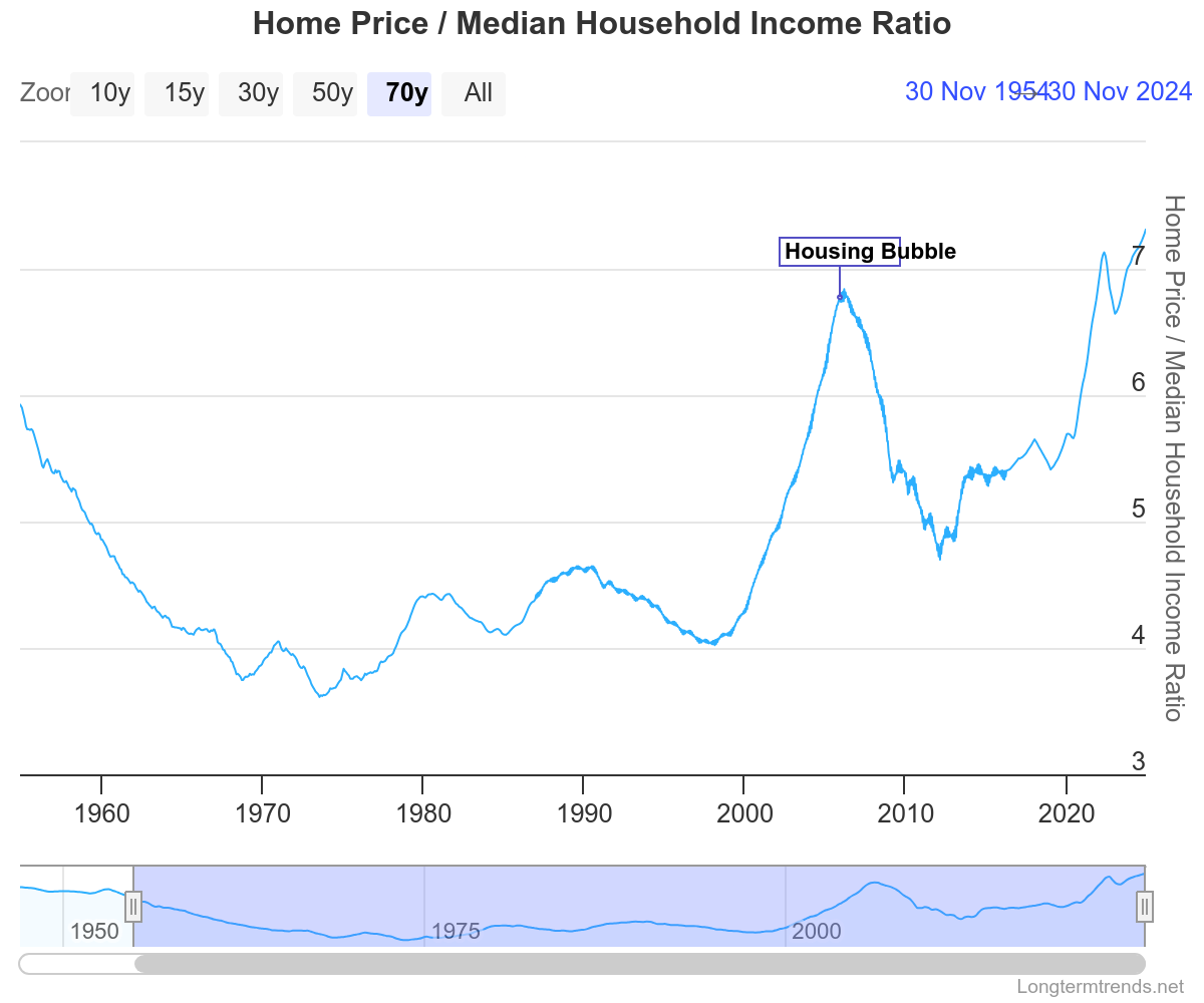
This shows the 1960s as a period of radically increasing affordability! And the 1970s as a decade where homes got a bit more expensive, but still nothing compared to either 1950s prices or the 2000s bubble. This contrast is helpful for identifying likely explanations for what happened.
Two key explanations come to mind for the collapse in affordability among low-income households from 1960 to 1980. Importantly, both are compatible with the trends we see in the Home Price / Income graph above. First is urban renewal and slum clearance. This took place mostly between 1957 and 1974. Hundreds of thousands of families, mostly poor and disproportionately Black, were forcibly displaced from their homes.
Not only did this entail the loss of a huge quantity of low-cost housing units, but it created a wave of low-income people looking (and competing) for new places to live. We should think of this as two separate sources of price pressure: reduced housing supply at the low end, and sudden impulses of increased volume at the low end. By volume, I mean the quantity of transactions or rental contracts that take place in a span of time. Rent prices go up for a number of reasons, but one of them is when landlords feel like they have a lot of options. The human aspect of this is important—it's about a feeling, or a perception. Prices are more likely to respond to a sudden and perceptible wave of renters than a drawn-out flow, even if the long-run changes in supply and demand are the same.
Second, there is the mass disappearance of single room occupancy (SRO) units. By way of example, both NYC and Chicago lost about 80% of their SRO stock between 1960 and 1980. In NYC, SROs had accounted for almost 5% of the total housing stock. According to Coalition for the Homeless, this effectively produced the modern crisis of homelessness. I suspect it had a significant impact on the overall proportion of units available to low-income renters. Both urban renewal and SROs are topics that will warrant their own posts.
There is so much to be learned from the above two graphs. They will continue to come back as we try to understand the present crisis, and what is to be done. They will be important anchors in reality when we look at the role of finance and investors, supply, land, construction prices. We will dive into these explanatory factors in future posts. Drop me an email if there are specific things you would like to see covered. Please consider joining as a paid member to support me in continuing this research. I think we're off to a good start.