Welcome / How Much of the Rental Market Can You Afford?

In this newsletter, I'll be sharing my research into the housing affordability crisis. I hope this will be a useful and accessible resource for people trying to understand why the housing market is so broken.
I'm going to try to make one to three posts per month. There will be lots of data and original research, as well as references to academic papers on housing economics, but my intention is that non-experts should have no trouble following the conversation.
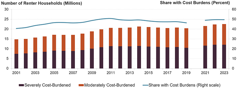
Let's start by looking at some recent history. If you're reading this, you probably already have the sense that housing is too expensive right now, and the rent is too damn high. The chart below shows the proportion of renters who are cost-burdened. Renters are cost-burdened if they spend 30-50% of their income on rent, and severely cost burdened if they spend more than 50% of their income on rent.
The share of people paying unaffordable rents keeps rising. Part of the story is house prices. The chart below shows the Case-Shiller Home Price Index adjusted for median household income since about 1946. The Case-Shiller Index tracks the sale prices of homes across multiple sales. It provides a sense of the cost of housing which is independent of changes to the quality of that housing. It factors out improvements (like the invention of fiberglass insulation) to give us a sense of how the market itself works.
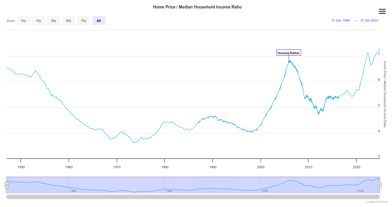
Look at the bubble, and look at where we are now! But the housing bubble of the 2000s was fueled by widespread issuance of bad mortgages, and there is little evidence that the same is happening now. There isn't strong evidence that this is a bubble at all. Rather, renters and younger-generation home buyers are being increasingly squeezed for cash. The rising prices are a mechanism for redistributing wealth from the poor to the wealthy, and from younger to older generations of homeowners.
But this is just a description of what's happening. It doesn't tell us why that's happening. We have to reject lazy answers like "It's because of greedy landlords," because those imply, implausibly, that landlords were not greedy from the 1960s through the 1990s.
Looking farther back in time, we see that in 1950, house prices were just below where they are now with respect to income. So what was affordability like, going back in history? This question will be a key part of this newsletter. Taking a long historical view and broad global view will give us perspective on housing under different economic arrangements. This will help us understand how the present crisis should be addressed.
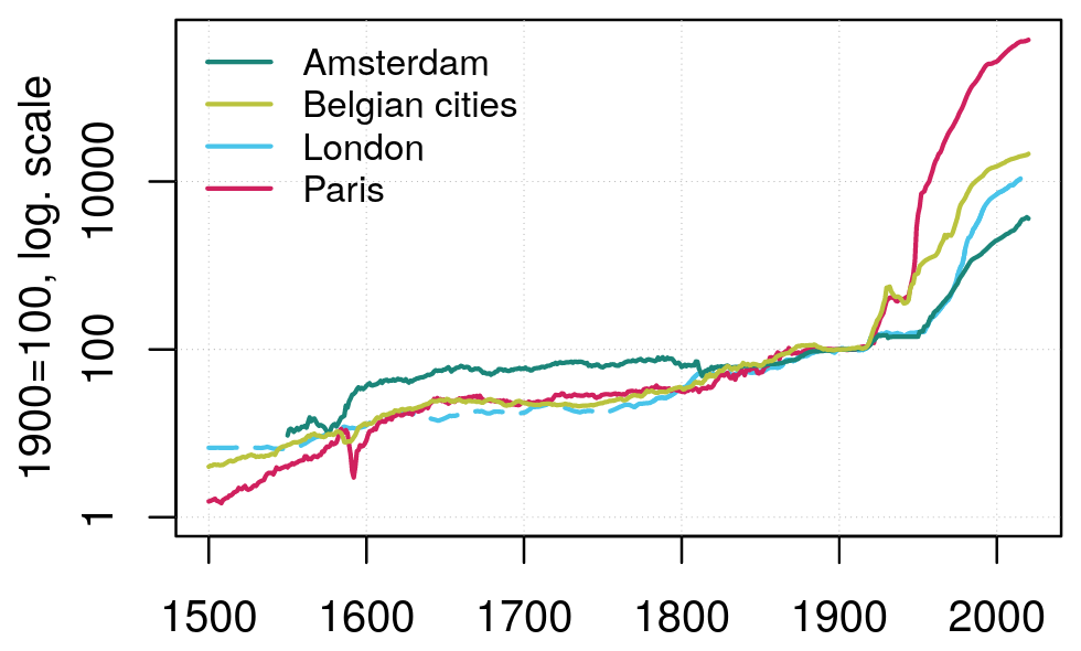
The chart above, from Eichholtz et al. 2022, shows nominal rents, adjusted as an index so they equal 100 in 1900. But this is just a teaser. To understand what this means in terms of affordability, we will have to see information on wages (and I disagree with how Eichholtz et al. did it). I leave that for a future post.
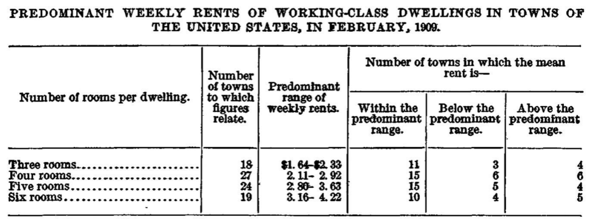
Since I don't want to leave you with the impression that the current crisis is just us going back to the bad old days, here's a fun fact. In the first decade of the 1900s, rent for a "four room house" (more or less equivalent to a modern two-bedroom house) cost about $10 per month, while the median wage was about $40 per month. So rent for a two-bed was 25% of median wages.
In 2025 the median monthly wage is about $4900 and average rent for a two-bedroom unit is about $1850. That's 38% of median wages.
That said, I don't like the median. 50% of people are doing worse than the median. The median is not relevant to those that live in poverty, much less those who are homeless. If you think housing is a human right, if you value political stability, or if you just want cities and towns to be nice places to live, you need to be concerned about the 25th percentile and the 10th percentile.* How can we get a clearer picture of rental affordability across the income spectrum?
*The 10th percentile income is the top income of the bottom 10% of income earners. So 10% away from the bottom. The 50th percentile is the median. The 99th percentile is "the 1%." Except in our case, we're talking about the top 1% just of tenants, not of everybody.The Rental Affordability Curve
I'd like to round out this post by introducing a great tool for looking at rental affordability: the rental affordability curve. This concept was first developed by Kevin Burke in a paper for Freddie Mac Multifamily titled "The Rental Affordability Curve: A Distribution of Affordability." The idea is to show what proportion of the rental market you can afford based on your household income. Here's a curve I calculated for New York City (the city, not the metro region).
This curve gives a sense of how much of the housing stock is affordable to people at different levels of income. Per tradition, a unit is affordable if rent is less than 30% of income—a renter paying more than that is "cost burdened." Along the horizontal axis we have percentiles of renter income for NYC. The median renter (the 50th percentile) can afford about 40% of the rental units in NYC. Put another way, if everyone arranged themselves into homes so that as many people could live in affordable units as possible, there would still be 10% of median income renters paying unaffordable rents. In actuality, about 61% of such households are rent burdened, an astronomical figure.
The situation is much worse further down the curve. A person at the 25th renter income percentile, which is about $24,400 in 2023, can only afford about 10% of the rental stock.
Okay, a brief technical note about the method, for those interested. My method is different from Freddie Mac's. I calculate the curve as a weighted average of submarket curves. A 4-bedroom unit is very different from a studio, and three minimum wage workers living together have different needs than a single person with an engineering salary. I resolve this by calculating the curve separately for each submarket. For each percentile of renter income in a region, I calculate the proportion of affordable units of each size. This gives the submarket curve. I then take the average of those values, weighted according to how many people at that income level actually live in a unit of that size. The Freddie Mac method instead standardizes units and households and makes a cost of living adjustment. Their method has its own advantages, but I think my method is a bit easier to interpret and has the very nice feature of having a well-defined dollar amount associated with each point on the curve.
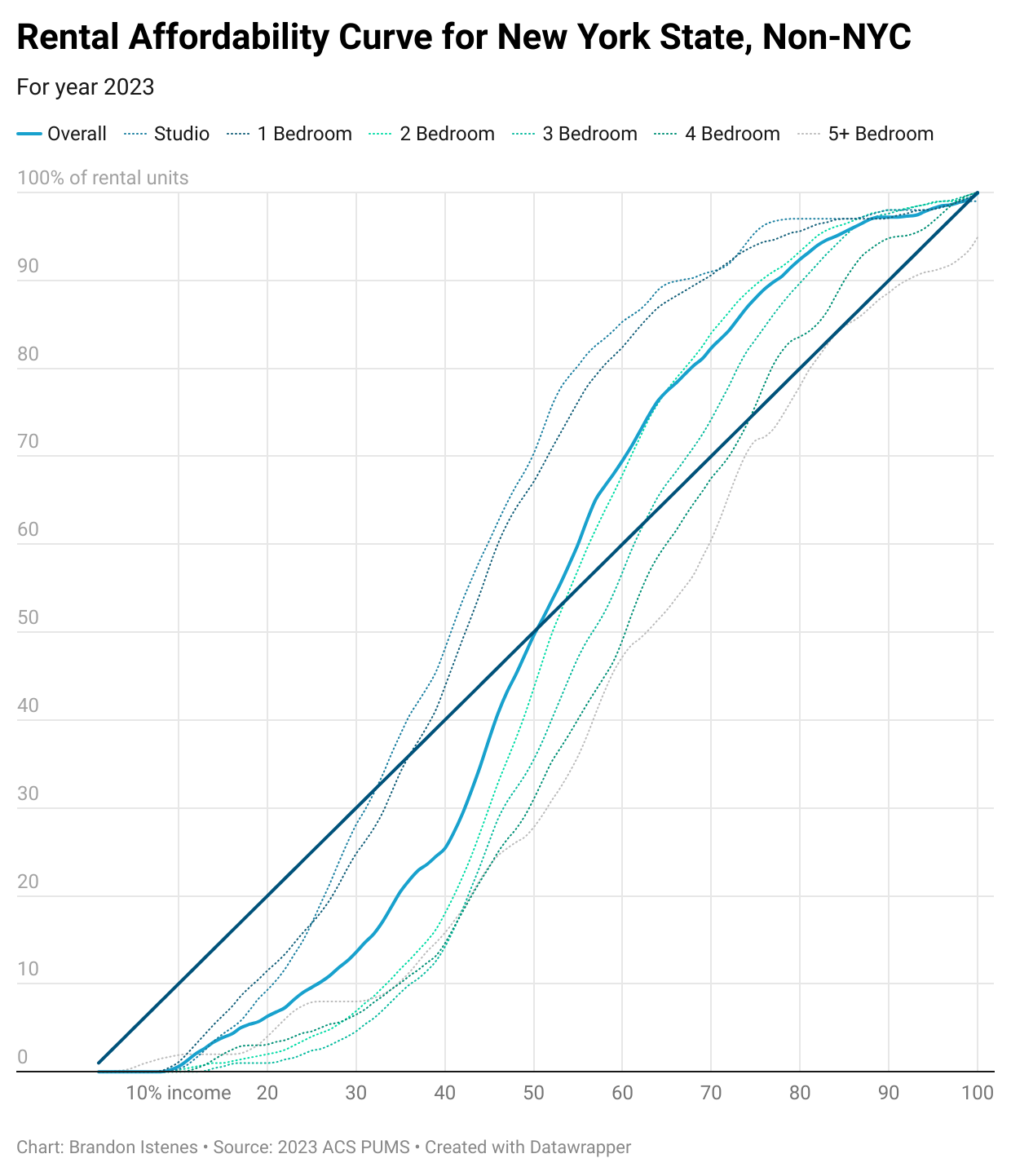
Okay, with that out of the way, here is the rental affordability curve for New York State excluding the NYC metro region. I have added the curves for each submarket so you can see how the sausage is made.
Most rental affordability curves have roughly this pattern: the bottom 15% or so of income earners have almost no ability to afford rent and will certainly depend on government support. The curve stays below the diagonal line for a while, indicating a shortage of affordable options. And then at some point it crosses above the diagonal, which indicates the point at which there are exactly enough affordable units to house people at that income level. Above that point the curve typically bulbs upward, indicating that those with enough money have lots of options.
For New York State outside NYC, the overall curve crosses the diagonal line right at the median. This indicates significantly better affordability than NYC around the median renter income. The median renter income is also much lower than NYC, at $42,000. But housing is just as unaffordable for the 25th percentile income household ($19,400) as it is in NYC.
It should be remembered that the shape of the curve depends on the incomes of the people that live in that region. Here's a curve for the San Francisco Bay Area, for example. Affordability reaches parity at the 56th income percentile. Seems comparable to the others! But in SF, the 56th percentile income is about $101,600, and the availability of affordable housing drops off rapidly below that. Below about the 40th percentile income, or $66,000, there is a severe lack of affordable housing.
I think this is a great tool for understanding affordability, and you'll see it often in this newsletter.
I'll often be posting graphs about the housing market in different areas. New York State will generally be included since I live there, but I will try to also produce charts for places that paid subscribers are concentrated. So sign up, and consider it your vote to get your city featured on here.
Want to see the rental affordability curve for another region? I will be publishing interactive data exploration tools for paid subscribers. The first will allow you to view the affordability curve for any region in the US. Regular posts like this one will continue to be free.
Got questions about housing affordability? Are there specific things you're hoping I'll research? Please reach out and let me know what interests you.
Thanks for reading and for being part of the conversation.